Introduction: Why Visual Consistency Matters
When customers see your brand across social media, a website, a flyer, or a product package, they should instantly recognize it. That instant recognition isn’t magic—it’s the result of a well‑crafted visual system that works everywhere. In this guide we’ll walk through the four pillars of visual branding: color psychology, typography selection, logo usage, and brand guidelines. By the end you’ll have a clear roadmap to keep your brand looking polished and unified on every platform.
1. Color Psychology – The Emotional Engine of Your Brand
Colors trigger subconscious responses. Choosing the right palette can reinforce your brand’s personality and influence customer behavior.
Key Steps for Effective Color Selection
- Define Your Brand Personality. Is your brand bold and energetic, or calm and trustworthy? Map those traits to color meanings (e.g., red = excitement, blue = reliability).
- Pick a Primary Color. This will dominate most of your visuals—think of it as the face of your brand.
- Add Secondary & Accent Colors. Use complementary shades to add depth without creating visual noise.
- Test for Accessibility. Ensure sufficient contrast for readability and check how colors appear for color‑blind users.
Example: A wellness brand that wants to convey calm might choose a soft teal as its primary color, pair it with muted gray as a secondary, and use a vibrant coral accent for call‑to‑action buttons.
2. Typography Selection – Giving Voice to Your Visual Identity
Typography does more than make words readable; it conveys tone. A sleek sans‑serif suggests modernity, while a classic serif hints at tradition.
Choosing the Right Fonts
- Limit the Font Family Count. Stick to 2–3 typefaces: a primary heading font, a body copy font, and an optional accent font.
- Consider Font Weight Variety. Use bold for headlines, regular for body text, and light for secondary information.
- Align Font Style with Brand Personality. A tech startup often uses geometric sans‑serifs, whereas a boutique bakery may prefer a hand‑drawn script for accent text.
- Check Legibility Across Devices. Test your fonts on mobile screens and at small sizes.
Pro tip: Pair a modern sans‑serif like Montserrat for headings with a classic serif like Georgia for body copy to balance readability and style.
3. Logo Use – Maintaining Recognition While Staying Flexible
Your logo is the cornerstone of visual branding, but it must adapt to various contexts without losing impact.
Logo Guidelines to Follow
- Clear Space Rules. Define a minimum margin around the logo equal to the height of the logo’s tallest element. This prevents crowding.
- Size Minimums. Specify the smallest size at which the logo remains legible (e.g., 24 px width for digital use).
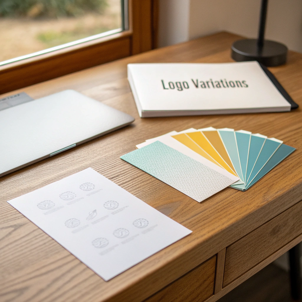
- Color Variations. Include a full‑color version, a single‑color (black) version, and a reverse (white) version for dark backgrounds.
- Do‑and‑Don’t Examples. Show incorrect uses—stretching, rotating, or adding effects—to avoid brand dilution.
When creating assets, always pull the logo from a master folder that contains the approved file formats (SVG for web, PNG for transparent backgrounds, EPS for print).
4. Brand Guidelines – The Playbook for Consistency
All the decisions above become actionable only when documented in a brand guidelines document. This guide should be a living resource that anyone creating brand material can reference.
Essential Sections of a Brand Guidelines Document
- Brand Overview. A brief statement of mission, vision, and personality.
- Color Palette. Hex, RGB, CMYK values for primary, secondary, and accent colors, plus usage ratios.
- Typography. Font families, weights, line heights, and sample hierarchy.
- Logo System. Placement, clear space, size, approved variations, and misuse examples.
- Imagery Style. Guidelines for photography, illustration, and iconography that align with the brand tone.
- Application Examples. Mock‑ups for social media posts, email headers, business cards, and website layouts.
Store the guidelines in an easily accessible format—PDF for offline use and a shared online folder (Google Drive, Dropbox) for quick downloads.
Putting It All Together: A Quick Checklist
- Define brand personality → map to color meanings.
- Select a primary color, secondary colors, and accent colors → test contrast.
- Choose 2–3 typefaces → set hierarchy and weights.
- Create logo variations → establish clear space and size rules.
- Compile a brand guidelines document → include color codes, typography specs, logo usage, and visual examples.
- Distribute the guidelines to all team members, freelancers, and partners.
Following this checklist ensures that every piece of content—whether a Instagram story, a PowerPoint slide, or a product label—speaks the same visual language.
Conclusion: Consistency Is Your Competitive Edge
Visual branding isn’t a one‑time project; it’s an ongoing practice. By grounding your decisions in color psychology, thoughtful typography, disciplined logo usage, and a solid brand‑guidelines playbook, you create a recognizable, trustworthy brand that stands out in a crowded market. Start today by auditing your existing assets, applying the steps above, and watching your brand’s visual cohesion—and customer confidence—grow.